 The latest iteration of my personal website.
#Table of Contents
#Features
 If you're on desktop, you can toggle between these themes by hitting
 Shift + D key on your keyboard. The theme can also be toggled using the theme toggle located in the top right corner of the page.
If you're on mobile, you can find the theme toggle in the side navigation pane after tapping the floating menu toggle in the top-right of the screen.
The app also supports a few different breakpoints, allowing you to browse the app effectively on both mobile, tablet and web.
#Framework
- A compiler
- A server side HTTP handler
- A server framework
- A browser framework
remix.config.js file under the key serverDependenciesToBundle. During the course of development I ended up declaring 20 such ESM dependencies in my remix.config.js file.
You can learn more about this in the Remix Gotchas Page.
#Styling
flex, w-full or bg-red-500 which correspond with the following CSS classes:
Styling your markup with these classes looks like this:.flex { display: flex; } .w-full { width: 100%; } .bg-red-500 { --tw-bg-opacity: 1; background-color: rgb(239 68 68 / var(--tw-bg-opacity)); }
In this way, you build up styles on a particular element by adding pre-defined Tailwind utility classes to the element. As you sprinkle these utility classes into your markup Tailwind automatically builds up a style sheet of the classes that you referenced. This means that you end up only shipping the Tailwind utility classes that you actually used in your app instead of the complete set of available classes. One of the things I most like about Tailwind is that it includes a very nice set of pre-defined systematic style primitives including: The above bullet points capture only a sliver of the style primitives available with Tailwind. Having well conceived and systematic style primitives to hand makes it a lot easier to create a user interface that is, from a style point of view, internally consistent. Now Tailwind does have some relatively minor pain points to consider. One such pain point I experienced was the necessity to learn and use Tailwind's terse utility class syntax. It is perhaps more accurate to describe this not so much as pain point but rather as as a learning curve. Indeed, Tailwind's class naming convention is generally logically conceived, deriving from some abbreviation of the underlying CSS properties to which it refers. So for example, if you want to apply some<div class="flex w-4 bg-red-500"></div>
margin-top to an element, you would apply the class mt-1 to the element. Or if you wish to apply some padding-bottom, you might do pb-1, and so on.
Despite Tailwind's class names being generally well chosen, I still often found myself forgetting exactly what property and property value a given Tailwind class was referring, and so, I frequently would refer back to the practically indispensible Tailwind Docs.
The Tailwind CSS IntelliSense extension for VS Code is an invaluable developer tool in this regard as it provides informative auto-complete suggestions like so:
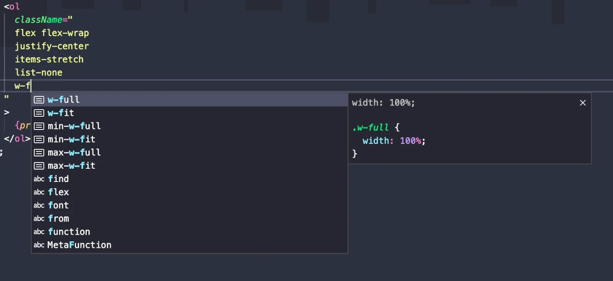 This let's you quickly see what CSS property and value is output by a given Tailwind utility class. Tailwind is a nice library on it's own, but this level of Intellisense elevates it to a whole new level of accessibility.
After writing a bit of Tailwind throughout this project, one trade-off I've noticed involves the accrual of many utility classes within your markup. Generally speaking, this isn't much of an issue. For example, here's the code for my footer component styled using Tailwind utility classes:
This let's you quickly see what CSS property and value is output by a given Tailwind utility class. Tailwind is a nice library on it's own, but this level of Intellisense elevates it to a whole new level of accessibility.
After writing a bit of Tailwind throughout this project, one trade-off I've noticed involves the accrual of many utility classes within your markup. Generally speaking, this isn't much of an issue. For example, here's the code for my footer component styled using Tailwind utility classes:
Now I reckon the above snippet is fairly straightforward and readable. We're defining some basic rules about how the footer and sub elements should display, how much margin and padding they should have, and what the color certain things should be in light and dark mode. If you're familiar with Tailwind class syntax then this might even be easier to gloss compared with reading the full styles from a separate CSS file. This is generally what Tailwind looks like in an ideal world. But things aren't always so straightforward, and oftentimes your style needs become more nuanced than the norm. In such cases, things can get a little of out of hand. For instance, to implement my theme toggle, I went with the input checkbox plusexport const Footer = () => ( <footer className="flex items-center justify-center p-8 mb-9 mt-9"> <div className="flex flex-col gap-6"> <hr className="border-t-1 border-slate-400 dark:border-slate-600 border-dashed" /> <div className="flex items-center gap-4"> <img alt="mugshot" className="h-20 rounded-full" src="/assets/images/mugshot.webp" /> <div className="flex flex-col items-start gap-4"> <Logo /> <p className="capsizedText">© 2022-present Thomas Trinca</p> </div> </div> </div> </footer> );
before pseudo element approach. Styling pseudo elements with Tailwind is possible but a bit tedious at times because you can only apply styles to a pseudo element using the before: directive and can't chain multiple style declarations under a single before: directive. Once you add conditional theme styles using the dark: directive, things can get rather verbose:
This code sample is a bit contrived for dramatic effect of course as we can easily apply some line breaks between classes to tidy things up.export const ThemeToggle = ({ toggle }: ThemeToggleProps) => ( <label className="relative inline-block w-14 h-7" title="Toggle colour mode"> <input type="checkbox" checked onChange={toggle} className="w-0 h-0 opacity-0" /> <span className="absolute cursor-pointer top-0 left-0 right-0 bottom-0 rounded-full bg-gray-300 dark:bg-gray-700 ease-in-out duration-300 before:absolute before:content-[''] before:h-5.5 before:w-5.5 before:rounded-full before:left-[3px] before:bottom-[3px]before:bg-gray-50 before:dark:bg-gray-900 before:ease-in-out before:duration-300 dark:before:translate-x-7"> <div className="px-1 h-full flex justify-between items-center text-slate-600 dark:text-slate-300"> <Sun /> <Moon /> </div> </span> </label> );
Adding some line breaks and grouping some of the classes together make things a little more readable. Indeed, I'd go as far as to say that this is still pretty manageable. Even so, this snippet serves to illustrate that you can end up with markup composed in large part of Tailwind class names in certain situations. There are a number of ways to mitigate this problem depending upon your development environment. If you're working within a component based framework like React then you can encapsulate an element along with a set of classes under a descriptively named component. Another thing you can do is abstract class strings out to separate variables. While this is a useful in some circumstances it is problematic for a number of reasons. For one thing, doing this introduces a step of indirection between your styles and your markup, which sort of jibes with the ethos of Tailwind. Furthermore, the Tailwind CSS IntelliSense extension only functions within the context of a class string, so abstracting your classes out to a separate string comes with a severe penalty from a DX standpoint. The Tailwind docs do propose some other tips to help mitigate utility class clutter, though these tips are mostly aimed at situations involving frequently repeated utility classes. One interesting option is to alias a set of regularly used classes under a new class using the @apply directive. While I can see theexport const ThemeToggle = ({ toggle }: ThemeToggleProps) => ( <label className="relative inline-block w-14 h-7" title="Toggle colour mode"> <input type="checkbox" checked onChange={toggle} className="w-0 h-0 opacity-0" /> <span className=" absolute top-0 left-0 right-0 bottom-0 bg-gray-300 dark:bg-gray-700 cursor-pointer rounded-full ease-in-out duration-300 before:absolute before:content-[''] before:h-5.5 before:w-5.5 before:rounded-full before:left-[3px] before:bottom-[3px] before:bg-gray-50 before:dark:bg-gray-900 before:ease-in-out before:duration-300 dark:before:translate-x-7 " > <div className=" px-1 h-full flex justify-between items-center text-slate-600 dark:text-slate-300 " > <Sun /> <Moon /> </div> </span> </label> );
@apply directive being circumstantially useful, I found myself creating new components most of the time throughout this project. On the subject of @apply, it should also be noted that Tailwind advises against using it to make things cleaner. Tailwind's rationale here is that using @apply for this purpose leads to deviation from the standardized and debug-able classes that Tailwind provides. This is partly because you must now invent your own class names to describe the set of classes you extracted with @apply and partly because you now must jump between files to discover what Tailwind classes are condensed under your custom aliases. Neither of these things are inherently problems per se, but they can lead to maintainability issues in the long-term without proper care.
Besides the DX ramifications of Tailwind's utility classes, one other interesting thing I experienced with Tailwind involved requiring styles that Tailwind doesn't provide out of the box. Fortunately, Tailwind provides a number of decent options here. One of the most powerful options available is the ability to define custom utility classes via the tailwind.config.js file.
For example, during the development of my website, I wanted to specify a brand color for and access that color through Tailwind. The way I went about this was to extend the Tailwind theme via my tailwind.config.js file like so:
With this, I can now apply my brand color to elements through various Tailwind utility classes like// tailwind.config.js /** @type {import('tailwindcss').Config} */ module.exports = { ... theme: { extend: { colors: { brand: "#be185d", }, }, }, plugins: [], };
bg-brand, text-brand, border-brand and so on.
One nice detail here is that Tailwind's Intellisense extension parses your tailwind.config.js file so that your theme extensions are provided as Intellisense suggestions alongside the regular Tailwind ones. Pretty neat!
I could probably write a dedicated blog or two about Tailwind's benefits and drawbacks, but suffice it to say, Tailwind is a fantastic tool overall and I would happily use again in future projects.
#Optimization
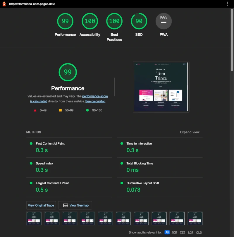 While there's still some room for improvement around SEO, on the whole it's looking pretty good!
I might add some PWA support at some stage but for now I don't particularly need it.
One performance optimization I performed to achieve this score involved converting all my
While there's still some room for improvement around SEO, on the whole it's looking pretty good!
I might add some PWA support at some stage but for now I don't particularly need it.
One performance optimization I performed to achieve this score involved converting all my PNG image assets to the webp format as well as scaling the resolution of my images to more appropriate sizes for their contexts. webp lossless images are about 26% smaller in comparison to png images.
Another optimization involved converting gifs to the WebM video format, which also lead to some significant reductions in download size.
One of the more interesting performance optimizations I attempted involved Font subsetting.
Font subsetting is the act of clipping unused glyphs from a font asset in an effort to reduce the asset file size. Since many fonts these days include an array of special and accented characters that you may not end up using at all, sub-setting your font may be a feasible and effective strategy of reducing the size of your font.
My site uses three different fonts - EB Garamond for serif, Montserrat for sans-serif, and IBM Plex Mono for monospace. While auditing my website with Lighthouse, I discovered that my serif font, EB Garamond, capped out at over 927 kB in size! Mind you, this was the variable edition of the EB Garamond font.
I turned to font subsetting in an effort to reduce this font asset footprint to a more reasonable size. While I managed to subset the font using the subset-font NPM package, and while this did indeed yield a dramatically smaller font asset, unfortunately this lead to some obscure console errors pertaining to corrupted font asset tables that I've thus far been unable to rectify. In my experience to date, these errors only crop up on Firefox and do so not seem to turn up on other browsers.
For the time being, I've settled on serving my required font assets via the Google Fonts API which yields relatively sane download sizes compared with my previous approach.
#Final thoughts
 To compare, my 2018 site was built with the Create React App framework and styled with the CSS in JS framework Styled Components while my new site is built with the Remix framework and styled with Tailwind.
If I had to rebuild my site from scratch again today I'd probably stick with Remix, even if it's a bit overkill for my needs, but I might reach for the CSS framework Vanilla Extract instead of Tailwind. Vanilla Extract brings a few extra things to the table that Tailwind does not provide, such as type-safe styles via TypeScript. And, in concert with the Sprinkles package included with Vanilla Extract, you can write atomic styles similar to Tailwind and Styled System.
To compare, my 2018 site was built with the Create React App framework and styled with the CSS in JS framework Styled Components while my new site is built with the Remix framework and styled with Tailwind.
If I had to rebuild my site from scratch again today I'd probably stick with Remix, even if it's a bit overkill for my needs, but I might reach for the CSS framework Vanilla Extract instead of Tailwind. Vanilla Extract brings a few extra things to the table that Tailwind does not provide, such as type-safe styles via TypeScript. And, in concert with the Sprinkles package included with Vanilla Extract, you can write atomic styles similar to Tailwind and Styled System.Some of the tech I worked with on this project: